To be invited as participants in a >Play< Restart is an exercise of responsibility due to the level of the attendees who participate. To discuss about graphic production, unusual topic, increasing its importance. Fortunately we do with Atipo so it calms enough because of the fluid dialogue we normally maintain.
Once there the pressure and nerves were diluted after the warm reception from everyone involved in the organization.
The following lines are some of the answers to the questions that arose during the afternoon.
Dani Seuba: When you work with production people you ask make me this. I think the relationship Atipo – Minke is quite different. The two added. How is it structured? When does it start? When do you throw the ball and the other returns better? How is that process?
Raúl (Atipo): The relationship started developing Minke‘s branding. That is already very different because they are the customer. It has given us the opportunity to start working differently. The first project was very interesting because in general the printing and the sector do not have good identity, few are those which are saved, when their audience is the graphic designer.
We saw it as an opportunity because you can do an identity, communicate values … their project was quite different in the sector and it also had a range of production which you do not usually have with a client. If you talk to a customer about paper, its nuances… he doesn´t see them. But here there were all possibilities. The relationship started very differently. Also what interested us is that their philosophy was very different from what we are used to working. It is advise.
People talk about production as “I am sending you this, fingers crossed and see what you show me …”. And the most important part is the previous. “I have a project, I want to convey this … but what do you advise me? You know more, what kind of finishes I need?” This changes the relationship. Patricia will also tell you how she decided to do something that in principle is quite kamikaze. In other countries a production agency it is better understood, but here the concept is printing and no more nuanced than that.
Dani Suba: How do you launch? Viewing your story, it shows the different philosophy and we’ve appreciated from first day …
Patricia (Minke): When you approach a project especially we’re talking about communication. A designer develops a branding and then he wants to develop for different media: analog, the typical stationery, online. But if you want to go out of it, if you really want to convey all that you have been devising, to communicate that philosophy, it doesn´t a common paper, or maybe yes, but not “well I call to the printer: Hey do me a budget of envelopes and letterheads…. “. No, before that step what kind of company is it? What values do you want to convey? For example, a company dedicated to the world of fashion, “we want something super tactile, if it can refer to the fabric textures …” why not. That’s previous work that Raúl says.
When a project reaches us we invested almost more time in the previous approach than in production. It is a rather difficult task because production has to accompany the design without the disguise or cover it.
Salome’s cards we have given is a great example. Atipo designed Salome’s typographycreating a super lush world, dagger, blood, death … Ismael saw a blind emboss for letters, a gold stamping but the important thing was that typography and image distinguished. “Maybe with that we take prominence. If we put a gold stamping it will not be the same as printed. Let’s undress finishings and accompany” we said. That is the key.
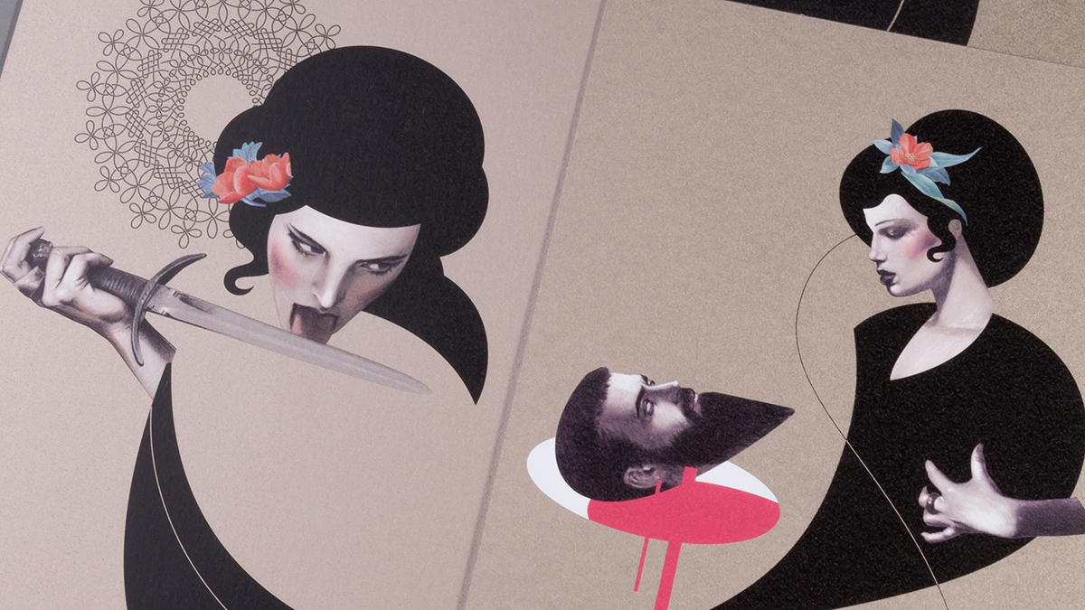
And how we do that? Salome asked a good impression and convey the murky idea that its history has. It can not be a complacent piece. At that time Antalis lauched a new paper, Curious Matter, a paper with a powerful black with a touch as sandpaper. So we said: “This is Salome.”.
With Atipo it is very easy. They talk you about the idea, they have everything well settled and we stripped the piece to what it really needs. After that we go with the budgets, etc. But especially considering production as an accompaniment of what they want for their client.
Wences: How was the project to develop the branding of Minke?
Raúl (Atipo): The process of branding, generally consists on strategy, analysis and to define a philosophy which later it is developed. When you have a good stuff everything is much easier. For example the first thing Patricia commissioned was a name to a naming expert. That already marked a very different start. If you are Gráficas González then you almost have to avoid the name. With Minke there was a game that gave us guidelines to start.
After analyzing a lot of graphic production of printers you see what they do is exuberance. I’m printer, my identity has fourteen finishings. They are identities whose image is the CMYK colors because they are working with. It’s like the cliché and then a lot of tools used uncontrollably.
What we wanted to do was avoid that. And the idea, the symbol we did, it has all the attributes that we had raised. On the one hand the tail of minke whales, while we suggested a symbol that could represent a book, we could speak of a diamond … it was a very compact symbol that suggested us many things. It let us materials were not in the function but they were interchangeable.

We made a business card with a die cutting. The color of the brand changes depending on the paper you put inside. Finally a production agency can not marry very strongly with color. Why most design studios have a very austere identity? Because basically they sold their jobs, you can not have a very mottled brand if you have a portfolio with many colors.
In a production agency it’s the same. We wanted to make a very austere image but very flexible to change. It was based on being classic, forceful and where materials were interchangeable. If for the card you have now there are remains of some sheets of paper that’s the color of Minke. It is a luxury of project because the papers that were used in the production are the ones you never ask a customer.

Dani Seuba: How is market acceptance? One thing has always struck me is your value proposition as Minke. It is different from the one on the market regularly. I imagine that when customers come to ask you a project even you have to explain a little.
Patricia (Minke): Sometimes we have to. Some customers arrive and they do not fit very well. They send you a photo from Pinterest “I saw this, I like the reference for a client and that´s all.”. Then you say “wait let’s see how much you planned to do, for what kind of project …” if they say they have little idea you start to grope and explain that we need some information before and then we work.
Always a strong emphasis on first approach is the production and after we continue doing quotes. So we got to start closing the spectrum and specifying what the customer really needs, if not, imagine all paper manufacturers, the possibilities of finishings, the combinations … Especially it is very important that we also have a reference, a sketch … to close and not to be in the abyss of working with nothing.
For example a business card. There are so many possibilities … if you come here, having many offers on the market, it is because you want something different. It is assumed that if people take over the paper it is meant somehow want to supplement their strategy. Because we will work there, we will work really, let’s do something thought for you. It may be a paper, a digital printing or whatever but it will be what your work is demanding, not what the printer said.
Wences: How does the idea of fonts arise? And then not only you desing a web and download it but also to make an object present?
Ismael (Atipo): To show only typography is just as naked. This allows you to explore ways to promote or even do. We like to do illustration, look for a concept, associate it with typography and this allows us to compose a video, a making-of, a website … We can show everything that we can do apart from selling typography.

Wences: The calendar of this year, all in white with white finishings, white papers … is a very risky project. Paper for Characters was also a risky project and then you see that risk at the end has its benefit in terms of impact, in this case equals. A calendar is not seen, then it works perfectly. It’s the feeling you have not with others. You implying otherwise has a paper, finishings, a design not seen but it really does feel.
Raúl (Atipo): That idea Patricia suffered because it was a time trial.
Patricia (Minke): All the work we have done for Minke or Atipo have taken much longer. The fact is in May we lauched the case Paper for Characters. It was a limited edition and we could not cover all customers. We did a diptych to reach more people but we left that feeling of saying “Let’s see if we do something for Christmas to send to all customers” and among the rush, time and work, in November, talking with Raul I said “Why not do something really easy for Christmas? Since we could not reach everyone with the box of Paper for Characters …. “.
They were up and Raúl told me they would see if during some break they thought something. This was earlier that month at the end when we thought we were not going to do anything, one day called Raúl saying he was sending me the presentation. It was not “easy”, but that concept didn´t deserve a negative. Go ahead. How do you say no?
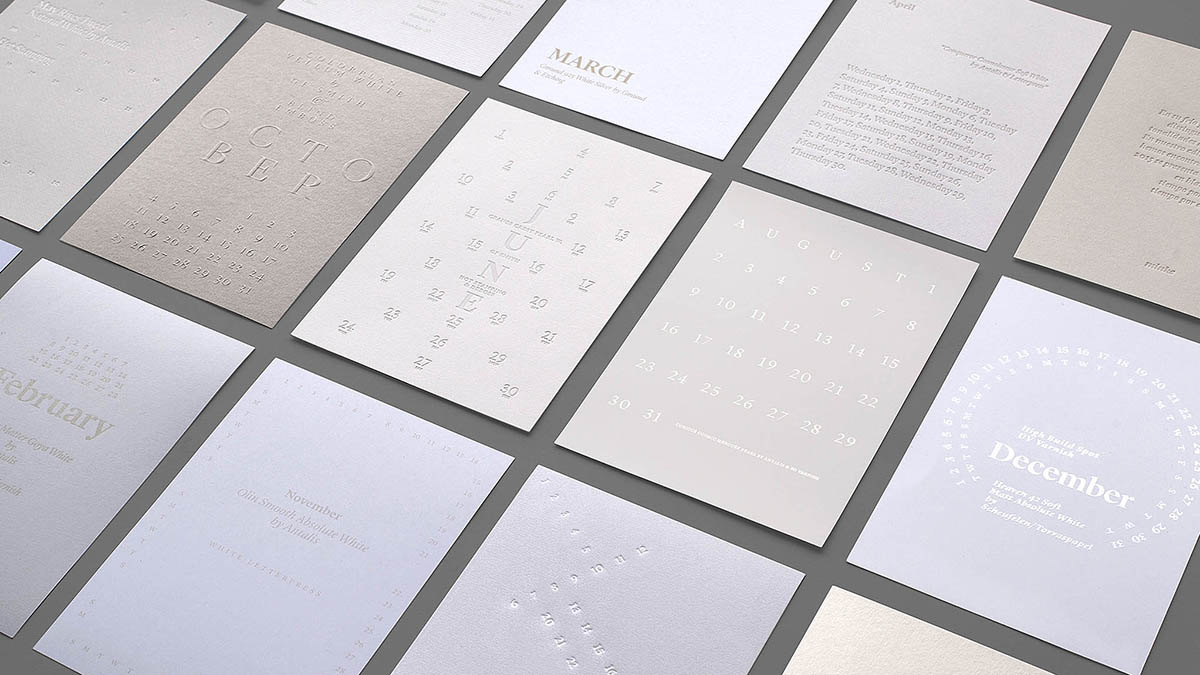
Raúl (Atipo): Yes, but you gave another turn. What we thought was a new year, a year in white with everything to do. Make everything in white and show things for different finishings (emboss, UVI …). The idea was to use different techniques. But then she said “twelve months, twelve different techniques with twelve different papers with enough nuances to read and continue been perceived as white. She suffered it enough. Illustrator is simple.
Dani Seuba: Raúl has struck me how you present on your computer with Keynote. How do you present a paper handling work?
Raúl (Atipo): The presentation is already a finished project. It’s a risk. I lived presentations with four proposals, with four ways … and I do not believe those stories. It’s a mess for customer.
We took a gamble more, but the presentations are very similar to what the product is. In Paper for Characters we did manipulations, we did the photography, with a very similar result to what it was in production.
They can tell you “you can not burn paper, we do not like your proposal”. And you made a presentation to which you have dedicated a lot of time.
We always do very finished presentations because many of the ideas come finishing it, many of the details appear. If you make a scheme in Illustrator then things do not happen, if you take a paper and start to manipulate it you can see that does not work or maybe arises you another idea.
That’s the way almost our proposals are. All the brands we have presented, except in details, have been developed. We have not lived stories of wrong or another way. There has been much work looking it was very consistent, it was a well constructed presentation, and then the client sees it and thinks “I’m seeing the finished work and convinces me. Go ahead “.
Dani Seuba: Among the things you have said it’s evident that both companies have a philosophy. Could you explain it?
Raúl (Atipo): The philosophy is more of a reflection about what I do not want, that what I want. I do not want to submit to these customers who do not appreciate the work. I do not want these methods of work. I do not want to work with this type of company. And you just looking for something that was not defined at the beginning.
Many things make more sense now. Even the name. Atipo came from an expression from north as bare-chested person. For example someone who wears t-shirt and it’s snowing. I went to Gijón with no customers and in the middle of a crisis. Atipo fits. And then it has other meanings as atypical, made with typography … when at the time we did not know we were going to make fonts. What you do is to avoid doing things you do not like.
There is an objective that is going to work and going to enjoy the job, with a result as I want to help a customer and a customer who likes what he does. It is not always the case but looking for that independence and the projects we have been doing and we are now developing are things that we find interesting. Either it is a product that we would consume … A production agency was one thing that even we needed. Then give them identity was something that was good for both. But in this story to go your way also you receive your hosts.
Patricia (Minke): What Raúl said about Atipo we have many points of connection. So I think we work together so well. We need time to work. The philosophy is “let’s get it right” but this can not plegarte everything the customer wants, for instance to be available on the phone, because I have to be thinking about your project, be at the machine controlling how we think has to be printed, etc. That’s the idea.
We are Minke, we do things right and work our way. These are our arguments, if you think proper, perfect, if not there is a lot of places. With the guarantee that if you let us to work we will worry about the job, we will be from the beginning to the end and we will do things as well as we are seeing here.
With a design like Atipo’s production is mere accompaniment, but always bearing in mind that the graphic production is not often with this design. Graphic production accompanies but to disguise or to try making good a bad design or a bad concept with a production it does not work.