The arrival of spring, with its days that little by little give us more time of light, in addition to spreading good spirits, invites us to give energy and another more optimistic and reflective perspective to what surrounds us: our work, social or domestic environment.
Those who in some way are related to the creative world, it seems that at this time of year we are more prone to approaches with materials of more vibrant tonalities. In Minke, it happens above all when choosing papers for the production schemes of our consulting.
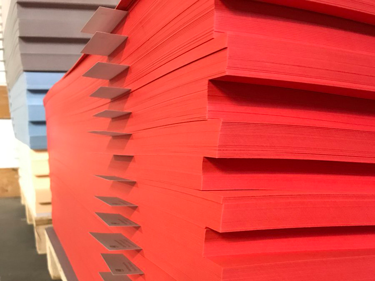
This year a good starting point is the Pantone Living Coral color (its most technical nomenclature: Pantone 16 – 1546 Living Coral) chosen by Pantone as the color of the year 2019 *.
So we are going to highlight, among the different offers of the market, the references of creative papers align with this powerful and attractive tone:
Keaykolour Coral: creative paper with a smooth surface and good rigidity available in 120 and 300 g.

Gmund Matt 92: creative paper with natural touch available in 120 and 240 g. It also has envelopes in format 11 x 22 cm and 16.5 x 16.5 cm.
Gmund Action Electric Blood: creative paper with iridescent particles and microtextured surface. It stands out for the intensity and homogeneity of its color. It has a single reference in 430 g and envelope in 11 x 22 cm format.

These three references, each with a subtle and distinctive nuance that completely sets it apart from the most common ranges and tones, are a good choice for projects that require outstanding visual strength and a good dose of novelty. Invitations and business cards with those papers have a spectacular reception.