

The most common concerns the renovation of the pharmacy: the distribution of its space, the design of its furniture, the lighting … All this aimed to turn the store into an attractive place where the shopping experience is pleasant and so positive that the client wants to return.
Those who go further strengthen the corporate image of the pharmacy. A good brand image attracts customers, helps their loyalty and provides a differential value. In this sense the shop window is a key point when transmitting the idea of pharmacy that it wants to communicate. The most audacious choose a global corporate identity that brings together design in all its elements without forgetting its stationery.
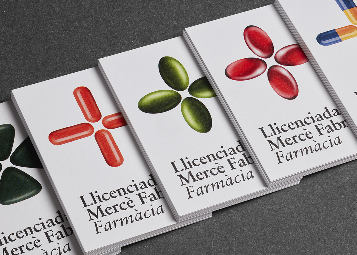
In this context arises the identity created by Fauna design studio. They decided to abandon the busiest lines in terms of the visual representation of pharmacies, with green as the guiding thread and the common cross as a flag, to dazzle with a burst of color and reinvent the symbol.
To these ingredients was added a graphic production with natural papers that stand out for their touch, print quality and appearance. Perfect accomplices that underline and allow each piece to shine with its own light: business cards, the folder for recipes and the control booklet.